1 July (Part 1) - Bonkers on the move
 My
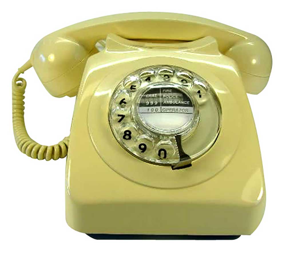
first encounter with a mobile telephone was in 1963. While undergoing training
with GPO telephones some young fools which included me, screwed a telescopic
aerial to a type 700 telephone, at the time the latest and greatest from an
organisation that had just left Bakelite behind, and took it on a train journey
pretending to be making calls. We thought it was very funny while fellow passengers
went looking for another compartment.
50 years later nearly half the visitors to this website are using mobile devices, most
of them being i-something or other. Not possessing such a device
myself I only know what users tell me about how Bonkers looks scaled down to quarter size.
Most say it is perfectly OK while just a few indicate it could be better, hence the recent
site tinkering.
Most obviously a ’mobile icon’ has appeared alongside the menu on most pages. Clicking it (†) will temporarily flick the page size to the same as an
i-phone when held horizontally. A similar A button appears to switch it back.
The blog pages have additional choices. Play with them and it should be fairly
obvious what happens. If you particularly like one setting you can fix it permanently in the Configure menu.
While researching all this I came across some code which allows a mobile device
to grab all the info it needs about a website to configure itself in the best
way it knows how. That code has been added but one tester has told me it tends
to override the other choices. It can be removed if it becomes a nuisance.
Because the site was not designed for mobiles, some of the older pages only
partially comply with the new arrangements. Everything from the beginning of
June 2013 onwards should be OK but other pages will have to be modified as I stumble across the offenders.
There are some pages that will prove near impossible to modify but
If anyone sees a problem please let me know, without a mobile phone of my own
I’m unlikely to find everything myself.
† For those with big thumbs, clicking anywhere on the blank portion of the
menu background will have the same effect as clicking the Mobile icon.
Note: The website was made fully scalable for smaller
screens
in May 2018 and since then most of it has been retrospectively made compatible. The Mobile icon is long gone.

